
Joseph Priestley, as you will no doubt remember, was a theologian, and a chemist best known for his pioneering work isolating elements such as oxygen. Chemist are accustomed to working with things you cannot readily see (atoms and molecules, energy, electron states, etc.). It was only natural that when Priestly was teaching history at the Warrington Dissenting Academy, he used these skills to visualize something else that is not readily visible — Time. Priestley is the inventor of that tool every project manager depends upon – the timeline.
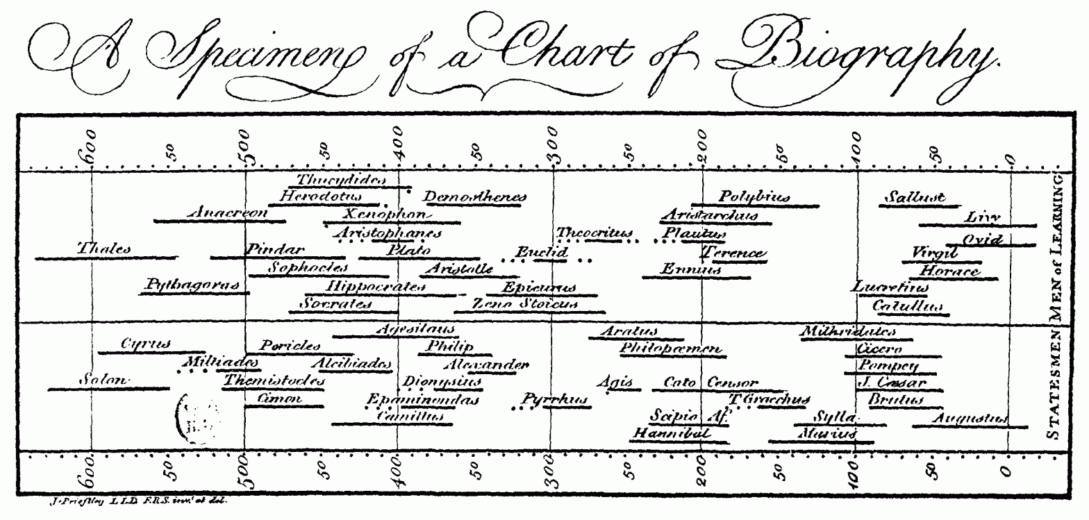
In 1765 Joseph Priestley published A Chart of Biography, then in 1769 he published A New Chart of History with A Description of a New Chart of History. Priestley believed these charts would allow students to ‘trace out distinctly the dependence of events to distribute them into such periods and divisions as shall lay the whole claim of past transactions in a just and orderly manner.‘ The Chart of History lists events in 106 separate locations; it illustrates Priestley’s belief that the entire world’s history was significant, a relatively new development in the 18th century. The world’s history is divided up into geographical categories (Scandinavia, Poland, Russia, Great Britain, Spain, France, Italy, Turkey in Europe, Turkey in Asia, Germany, Persia, India, China, Africa and America) then it shows the history of empires and the passing of power.

This depiction allowed Priestley to show the relationships between world events without resorting to rote memorization of dates and events. The horizontal line conveys an idea of the duration of fame, influence, power and domination. A vertical reading conveys an impression of the contemporaneity of ideas, events and people. The number or density of entries tells us about the vitality of any age. Voids in the chart indicated intellectual Dark Ages.
These relationships weave an intricate story. Priestley and his students could now better discuss how civilizations grow, collapse, expand, and collide. After their initial publication, the Chart of Biography and New Chart of History met with great acclaim and decades of popular demand and we use similar charts today for everything from teaching history to managing complex projects to keeping track of our daily agendas.
Want to have the
Regimental Brewmeister
at your site or event?
You can hire me.
https://colonialbrewer.com/yes-you-can-hire-me-for-your-event-or-site/
